
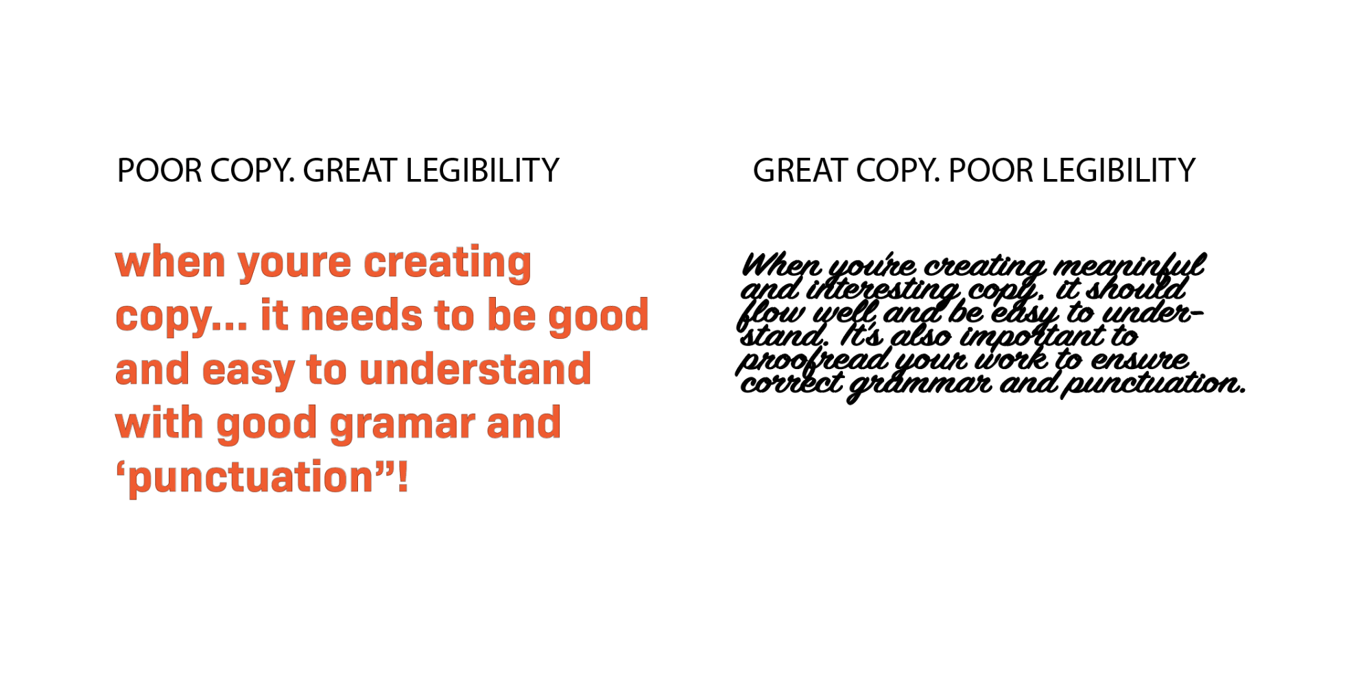
Typography is more than just the aesthetic arrangement of letters on a page or screen; it is a critical component in shaping how content is perceived, processed, and understood by readers. The concept of rhythm in typography is rooted in the way our eyes move across text, the natural pauses we take when reading, and the visual cues that guide comprehension. Designers who master typography rhythm systems understand that readability is not merely about choosing a legible font but also about orchestrating a seamless flow of visual and cognitive information that aligns with human perception.
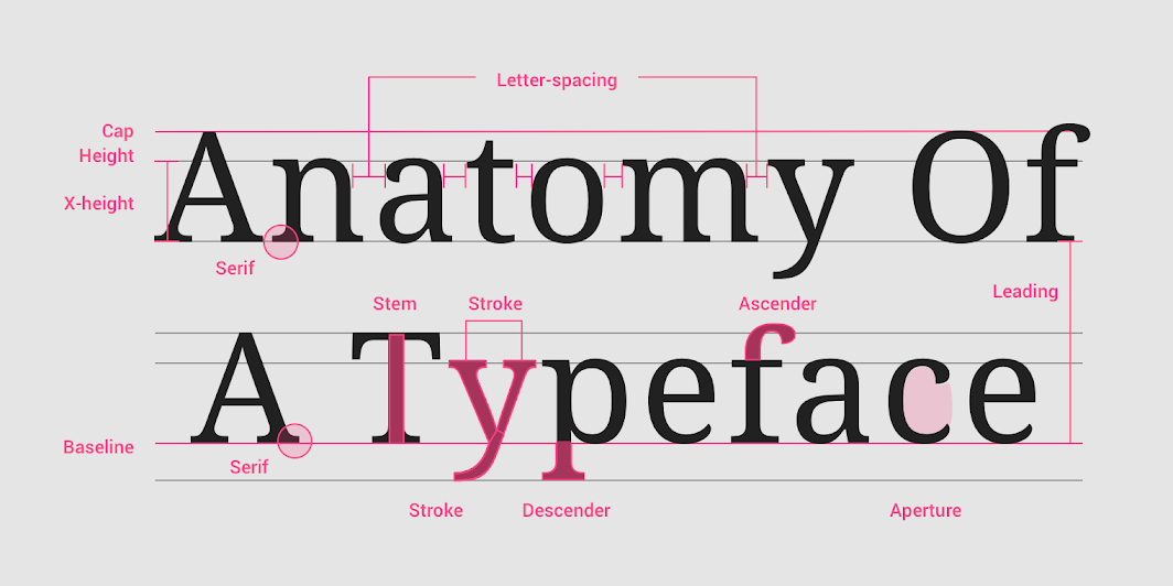
At the heart of typography rhythm systems lies the principle of consistency. Consistent spacing, line heights, and alignment establish a visual pattern that the reader’s eye can follow effortlessly. This rhythm reduces cognitive load because the brain does not have to constantly adjust to varying structures, allowing it to focus on content rather than deciphering presentation. For instance, maintaining a consistent line height that is proportional to the font size can significantly enhance readability. Lines that are too cramped or excessively spaced disrupt the natural flow of reading, leading to fatigue and decreased comprehension. The baseline grid is an essential tool in this regard, serving as an invisible scaffold that ensures text elements align harmoniously across columns, headings, and other typographic components. By anchoring text to a grid, designers create a predictable rhythm that feels natural and stable to the reader.
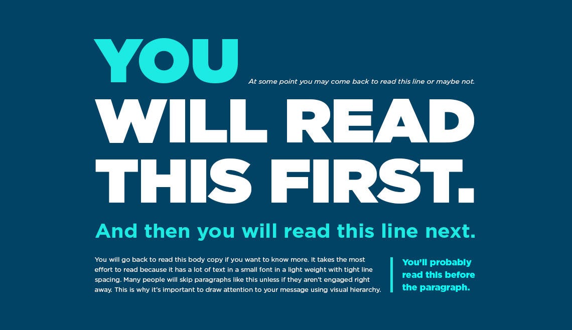
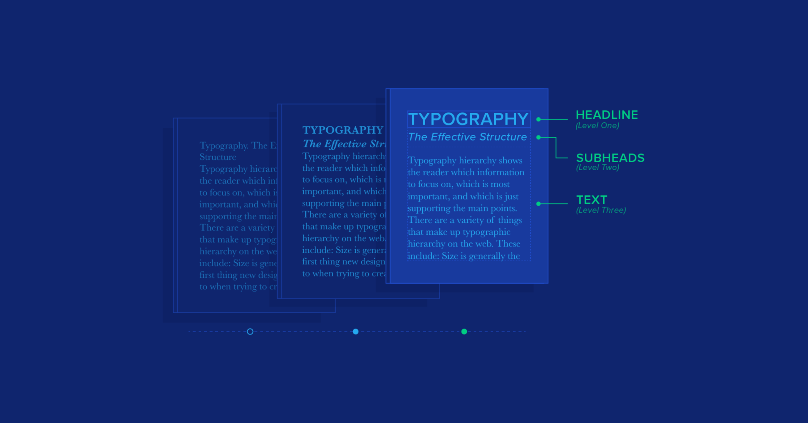
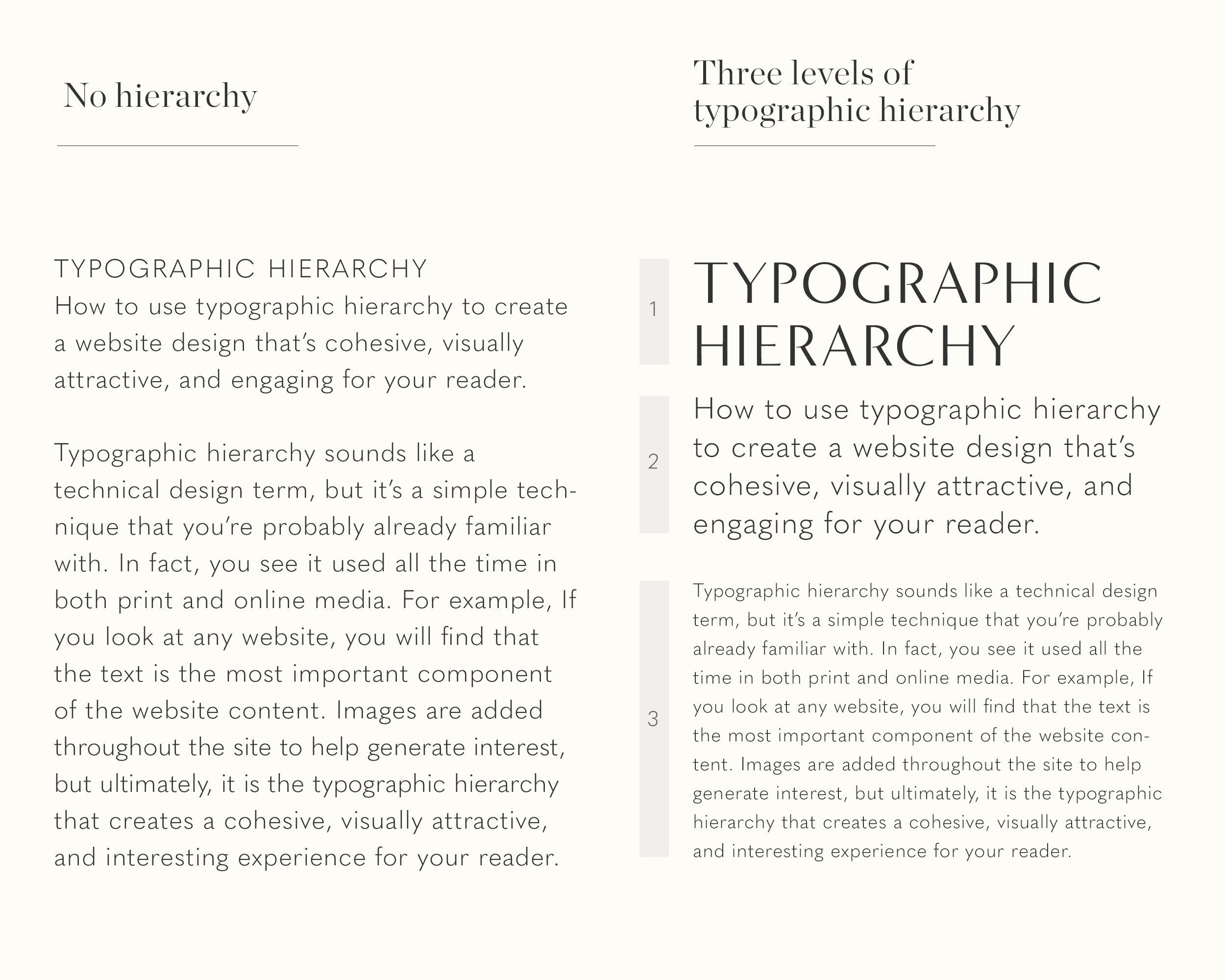
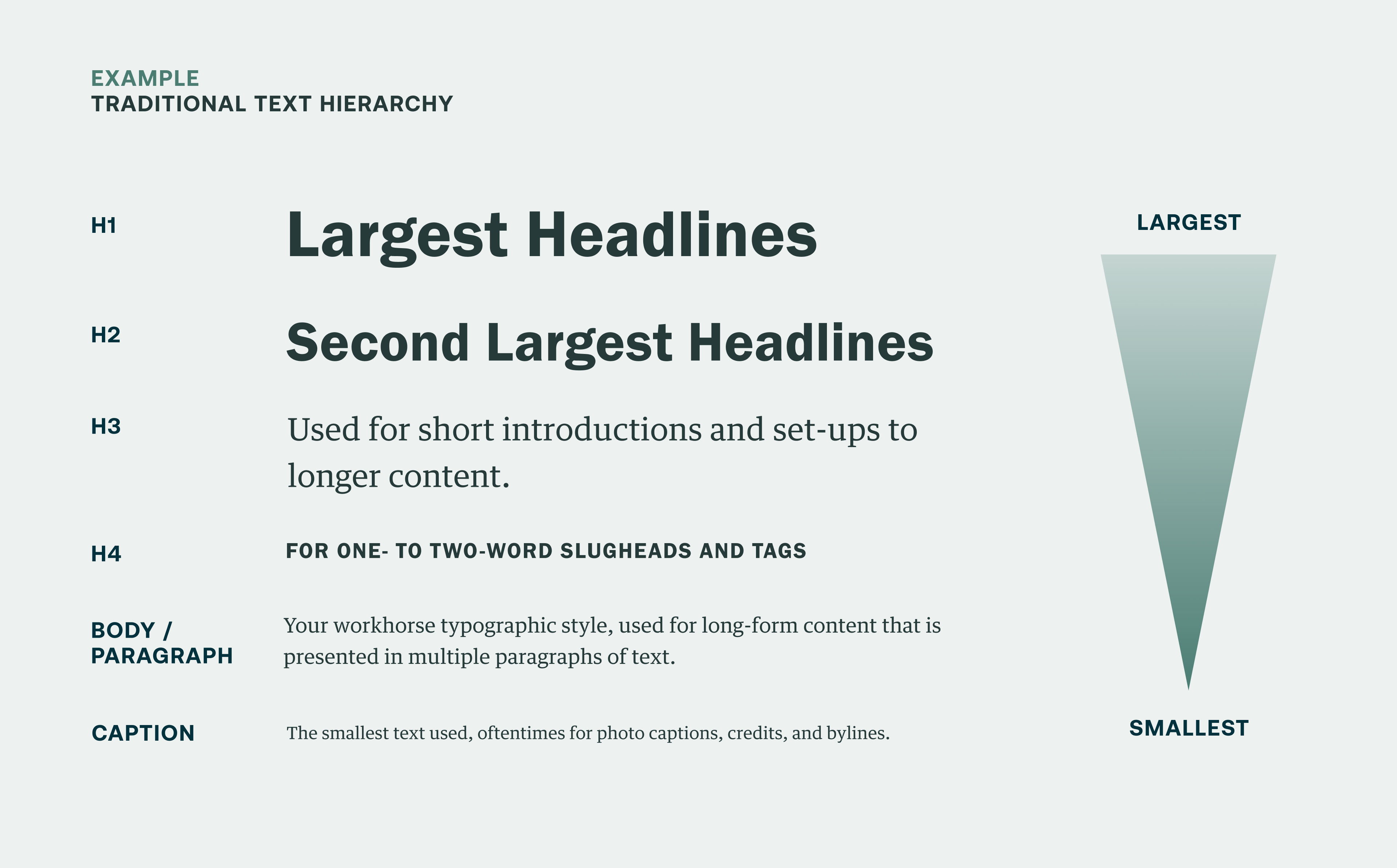
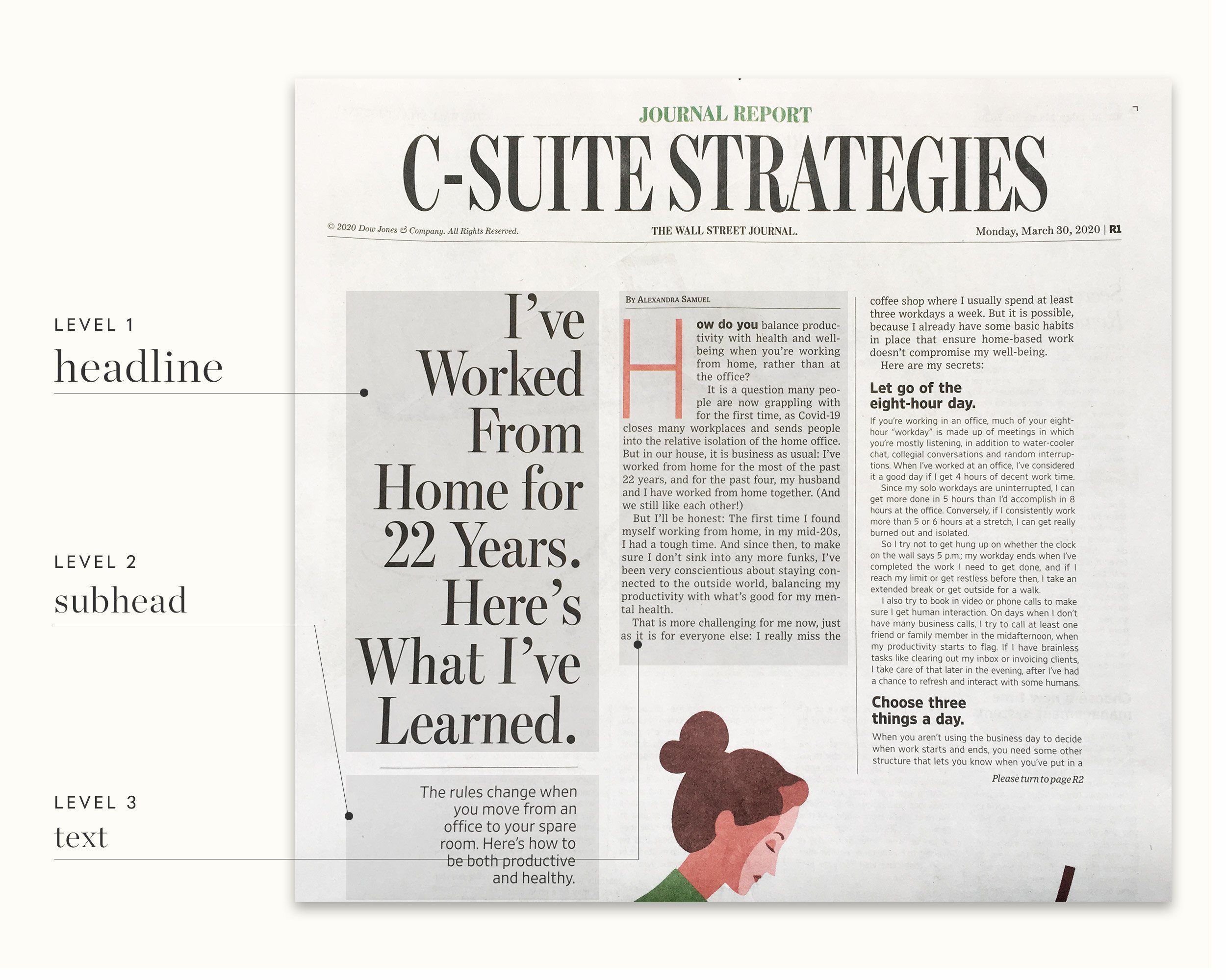
Another crucial element in typography rhythm systems is the careful orchestration of hierarchy. Hierarchy is the visual differentiation between various levels of information, such as headings, subheadings, body text, captions, and footnotes. When hierarchy is clear and rhythmically structured, readers can scan and interpret content efficiently. The strategic use of weight, size, and contrast in fonts guides the eye in a deliberate manner, helping readers discern primary messages from secondary details without conscious effort. Effective hierarchy also considers the spacing between elements. Adequate margins and padding around headings or between paragraphs act as visual breathing space, enhancing the overall rhythm and preventing information overload.
The interplay of font choice and letter spacing also significantly impacts typographic rhythm. Fonts are not simply containers of characters; each typeface carries an inherent pace and personality that contributes to readability. For example, fonts with generous x-heights and open apertures tend to feel more relaxed and readable at smaller sizes, whereas condensed or decorative fonts may impose a faster, denser rhythm that can tire readers over extended passages. Kerning and tracking adjustments further refine the rhythm by controlling the horizontal spacing between individual letters or groups of letters. Thoughtful adjustments in spacing can create a sense of continuity and smoothness, ensuring that text feels neither rushed nor fragmented. Rhythm in typography is not static; it adapts depending on context, device, and reading environment, which is particularly important in responsive design where text scales across different screen sizes.
Paragraph structure is another dimension where rhythm manifests in typography. Paragraph length, indentation, and line breaks contribute to the pacing of reading. Short paragraphs interspersed with longer ones create a dynamic visual rhythm that can sustain engagement, while uniform paragraphs might establish a steady, meditative pace ideal for long-form content. Similarly, the strategic placement of bullets, numbered lists, and block quotes introduces micro-rhythms within the overall text, giving readers points of rest and emphasis. These structural cues allow readers to navigate complex content more easily and reduce mental fatigue, highlighting the importance of rhythm as a functional, not merely decorative, attribute.
In digital contexts, responsive typography adds an additional layer of complexity to rhythm systems. Screen size, resolution, and pixel density influence how rhythm is perceived. Designers must consider line length, vertical rhythm, and contrast ratios to ensure that text remains legible across devices. For instance, a rhythm that works well on a desktop may appear disjointed on a mobile screen if line heights or spacing are not adjusted proportionally. Scalable units such as ems and rems, rather than fixed pixels, facilitate fluid rhythm that adapts to different viewports while preserving the visual flow. Dynamic adjustments in real-time, such as responsive font resizing or modular scale, maintain the integrity of rhythm and support accessibility standards for readers with visual impairments.
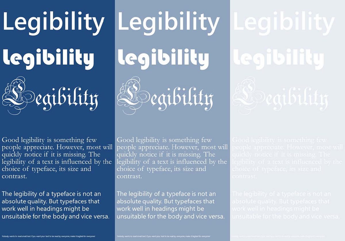
Color and contrast also play a subtle but influential role in rhythm. High-contrast text on a background can create sharp visual beats that direct attention, while lower contrast can generate a smoother, more relaxed flow. Designers often use contrast rhythmically to emphasize key phrases or guide the reader’s gaze through sections of content. Similarly, typographic color—the overall density of text blocks—affects perceived rhythm. Dense, dark blocks of text can feel heavy and slow, while lighter arrangements with ample spacing appear more agile and approachable. The balance between text weight, spacing, and visual hierarchy orchestrates an overall tempo that can enhance both comprehension and aesthetic pleasure.
Typography rhythm systems are also informed by cognitive psychology and reading patterns. Studies of eye movement during reading reveal predictable saccades and fixations, showing that readers move in short, deliberate jumps along lines of text. Designers can leverage these insights by creating rhythm through consistent line lengths, appropriate word spacing, and strategic punctuation placement. For example, em-dashes, commas, and paragraph breaks act as natural pauses in the visual rhythm, supporting cognitive processing and reinforcing the content’s narrative structure. The rhythm of typography, therefore, operates on multiple scales—from the micro-level of individual letters to the macro-level of paragraphs and page layout—interacting to form a coherent and readable experience.
Ultimately, effective typography rhythm systems transform reading from a mechanical act into a fluid, almost musical experience. They create an invisible scaffolding that supports comprehension, attention, and engagement while accommodating diverse audiences and devices. Designers who prioritize rhythm understand that readability is a dynamic quality, dependent not only on legibility but also on pacing, hierarchy, spacing, and visual consistency. By applying these principles thoughtfully, they craft texts that are not only easy to read but also intuitively navigable, aesthetically pleasing, and cognitively efficient. Typography, when orchestrated with a sense of rhythm, becomes a silent guide, harmonizing content and reader in a seamless, enduring dialogue that transcends mere words.
This layered approach to typography rhythm ensures that every line, every paragraph, and every block of text contributes to a larger, coherent visual cadence. It is the interplay of consistency, hierarchy, spacing, font characteristics, and cognitive awareness that enables typography to serve as both a functional and expressive tool. Through the careful design of rhythm, text becomes more than a vessel for information; it evolves into an orchestrated experience where readability and aesthetic harmony coexist, ensuring that readers can engage with content comfortably, efficiently, and with lasting impact.
Through continuous refinement and testing, designers can optimize rhythm systems to accommodate different reading contexts, from printed books to digital screens, from casual browsing to focused study. The result is a typographic experience that feels natural, intuitive, and effortless, proving that rhythm is not an abstract concept but a practical mechanism essential for clarity, comprehension, and enduring readability.

Leave a Reply